If you are a proud and looking-forward business owner, launching a modern, feature-rich and responsive website for your company is a must for the myriad of reasons.
First of all, going online provides you with a bunch of opportunities to outshine your local competitors by showcasing your portfolio, and the wide range of services.
Secondly, a clear and functional online store with a variety of products can bring you customers from around the world.
So, if you are interested in growing and scaling your business globally you need to make an effort and design a beautiful and user-friendly website. Do not let those simple web design mistakes destroy your business and reputation.
Show Your True Colors, but Not Too Many!

Use colors in your website design wisely! Pick the right palette that will perfectly represent your brand and make it memorable, however, do not overdo with colors. Text with various colors may look rather confusing, as a brightly colored sentence often stands for hyperlinks and CTA buttons. You can apply bold or italics to underline some important information, but when it comes to colors – use two: one for the text, and one for the links.
Poor Quality of Images and Content
Make sure your website looks visually appealing. Use high-quality images that are appropriate for your color scheme and are connected to your business. Do not overload your website with huge text blocks and long texts. Let your website visitors find everything they need at once.
Desktop Version Only: What?
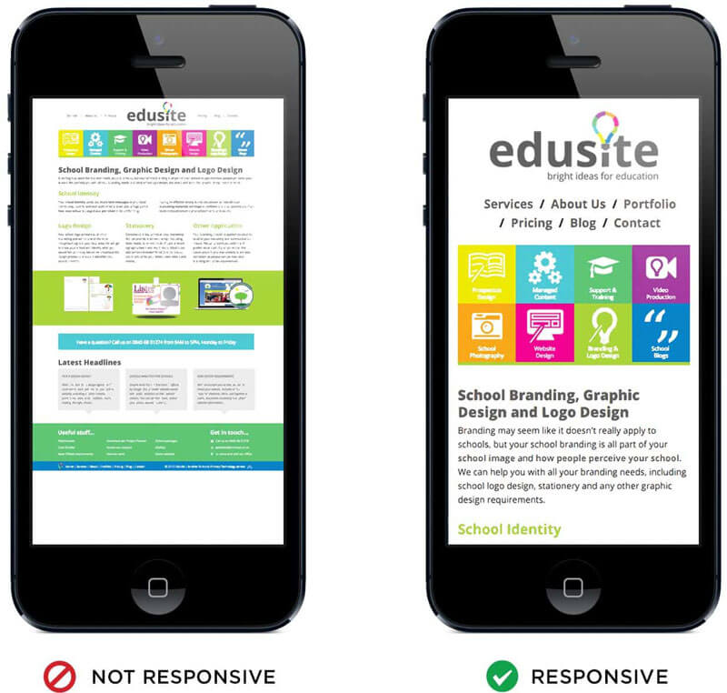
Just imagine how much time you spend surfing the internet on your computer in comparison to your smartphone or tablet. Do not underestimate the power of mobile users and their abilities to buy products and make an order online. Ensure that your website is mobile-first and looks perfect on each and every device.
Invisible Contact Info and Social Links
Remember that you’ve created your website in order for your target customers to be able to reach to you easily and in a matter of seconds. Try to have all the necessary contact information in the footer and do not hesitate to put the link to your social media accounts on your homepage.
Lacking Navigation and Unclear CTA Buttons
Guide your visitors by creating clear and simple navigation. Do not forget about the importance of the proper CTA, as it is the one to tell your customers what to do!